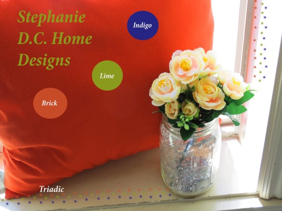
- Description: This is my photo for the activity of a pillow and some of my decorations. I tried to use the same colors with the flowers and the pillow and pulled the green from the leaves.
- Process (Programs, Tools, Skills, FOCUS principles): I used Photoshop for the entire process of editing and adding designs.
- Message: For the photo I added the message that this was an example of Stephanie D. C. Home Designs. It could be an advertisement for a business.
- Audience: The audience could be anyone that sees the advertisement. The audience is also my classmates.
- Top Thing Learned: I actually learned so much from doing this activity. The top thing I learned was the benefit of manipulating an image to enhance the quality. It also helps to manipulate the image to make the message clearer.
- Color scheme and color names: I used the triadic color scheme. The colors I used were indigo, lime and brick.
- Title Font Name & Category: Minion Pro Bold Cond Italic is a serif font.-
- Copy Font Name & Category:
- Thumbnail of original, unedited image inserted
- Date and location you took the photo(s) I took the photo at my apartment.
- Comment
- Reblog
-
Subscribe
Subscribed
Already have a WordPress.com account? Log in now.

I really like the lighting in your project! I think that the color scheme that you have works very well with your image. I like how you added the dots into your design, they really add a lot to it. I also like how clear and vibrant everything is in your design. I really liked it overall!
Look at Grace’s Project
https://gracecommportfolio.wordpress.com
Look at my project
LikeLike
I really like your picture! I like your color scheme and how you added the little polka dots around the image to incorporate your scheme into the design. I love how you edited the photo so that the colors in the scheme look like the come straight from the picture to help create unity. Your font choice suits your design and image very well and is very easy to read. Your design flows really well from the title to the color scheme to the flower jar in a diagonal alignment which is really nice for the eye.
Check out my design:https://gracecommportfolio.wordpress.com/2015/10/17/project-3-photodesign/
LikeLike
Hey Stephanie!
I really like your design! The photo was done really well, especially with following the rule of thirds. Your color scheme is really nice. The only thing I would do is try to maybe make it a little lighter, or incorporate the flower color with the hint of yellow into your design. Overall, I really like it! Good job 🙂
if you want, here’s my design!
LikeLike